2018年9月19日水曜日

MACBIA Goal

My MACBIA Goal

 My MACBIA goal is to remember how to write Russian alphabet in cursive writing.
It is a measurable goal since Russian alphabet has 33 letters. Since I learned 100 vocabularies during the Russian class in the spring semester, I would also like to write those vocabs in cursive  without checking how to write each alphabet.
 I hope this goal is achievable since I've already learned how to write printed style writing and each alphabet's pronunciation. However, this will be so challenging since Russian alphabets are not similar to English alphabets. Actually, there are quite similar alphabet within the Russian, such as ш щ ц.
 Yet, this goal is quite beneficial because in Russia, people only use cursive writing. I'm planning to visit Russia in this winter, so I need to know how to read and how to write those words. To make this goal achievable, I divided into some steps. I will start from long vowels (5 letters), short vowels (5 letters), and consonants (rest of them). It may take 3 days for remembering 5 letters. About in a 7 weeks, I will be able to write those letters in cursive.
I also have a friend in St. Petersburg, and I often text with her. Hopefully, she is going to check how it goes and readable or not. 

2018年6月1日金曜日

Ad Analysis (CRAP Analysis)


 I'd like to talk about this advertisement which I found at the Shinjuku Station. This is mainly about Japanese anime called 'POP TEAM EPIC'(ポプテピピック) and its greatest hits soundtrack album. I don't know about this anime so much, but it will be fun to analyse the poster from a third person's perspective.

 Firstly, let us consider contrast. When we look at the use of colour, this mainly use two different colours for the font: blue and red. Red and blue are the similar, yet those two colours can make people's attention like a traffic light. Also, the background colour is pale yellow. This makes stronger contrast and can make more attention. Moreover, use of colours for illustrations are fantastic. Compared to information in the centre, those colours are pale and light. This can also make stronger contrast between letters and the illustration.
  
 Second consideration is repetition. Since this is a single poster, it is difficult to find repetition. However, when we focus on illustrations on the poster, you can find two different characters.  In total, you can find 23 characters. Instead of using phrases or words, this poster uses illustrations and make people's attention. 

 Thirdly, let us consider alignment. Important information, such as a title of the anime, release date, and descriptions are aligned on the centre. Also, the illustrations surround the words and this can accentuate the most important information. It could be said that the best part for this poster is  alignment and it was hard to find an improvement for the aliginment.

 Finally for proximity, it could be said that some of the information are too close. If it has more space between each other, it will make more effective advertisement. Yet, this is quite reasonable since different size of fonts are used.

 Overall, this poster has quite effective uses of: contrast, repetition, alignment, and proximity. Possibly this can attract people who haven't seen the anime before. 


2018年5月28日月曜日

Favorite Place to Eat in Ikebukuro


 The best place to eat in Ikebukuro is 'Saizeriya' which is the cheapest Italian chain restaurant in Japan. I'm pretty sure that Ikebukuro has variety of unique restaurants, but if you can not decide where to go, here might be the best. You can find two 'Saizeriya' restaurants nearby the station, but the closest Saizeriya is located in Ikebukuro Nishiguchi, and it's pretty much close to the Tokyo Metropolitan Theatre. It's just on the way to Rikkyo, so you can possibly go after classes or during the lunch time. There is many students and office workers especially in the lunch time. It's pretty lively and bustling (Since here isn't a formal Italian restaurant, it's better not to come for dating).


The best part of this restaurant is price. Everything in this restaurant is quite cheap. For example, you can eat pizza in \399. Moreover, a bottle of wine costs only \399 which is quite reasonable compared to other Italian restaurants in Ikebukuro. If you like to drink with co-workers (and If you are an adult) why don't you go there? Maybe you can be satisfied in less than \2000.
 One thing I want to mention before you go there is; please do not have a higher expectation for taste. Since the price is quite cheap, the taste is also cheap. Since I'm a student, I don't really care about the taste but I do care about the price. Anyway, here is good value for money.

2018年4月29日日曜日

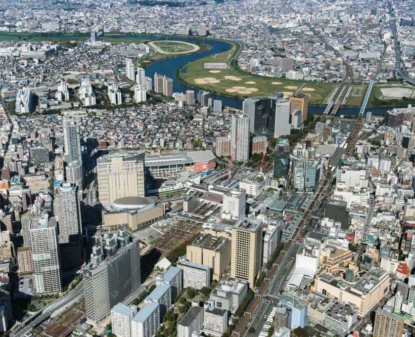
My City: Kawasaki


People who live in Yokohama or Tokyo often say, "Kawasaki City is not safe to live."
 Honestly, I can't disagree with them, because in certain extent, this can be true. For example, many homeless are living just next to the river, drunk people are screaming nearby an arcade, and shady shops in the arcade. 


Only few areas like the east side of Kawasaki Station and industrial area
are recognized as  "not safe area". 
 Except for those places, Kawasaki is 100% good place to live. 

1. Compared to Yokohama and Tokyo, the cost of living is cheap. You can find variety of shops with reasonable prices. 

2. Since Kawasaki is sandwiched between Yokohama and Tokyo, really easy to go various places like Minatomirai. (You don't really need to go out Kawasaki though)


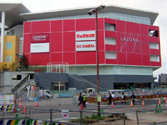
3. There is two major electronics retail stores next to the station: "BIC Camera" and "Yodobashi Camera". You can go both stores and beat down the prices if the shop is selling in more expensive than the another shop.

4. You can meet variety of people. When you walking down the street in Kawasaki, you can find multi-national shops. Many people are from China, Korea, India, Nepal, and countries in South America. You can try anything you want!

Finally, I can say that Kawasaki isn't a place for sightseeing. There is nothing famous of specific to go. However, as I said it before, it's awesome place to live!